
Role
Research Assistant & Dashboard Designer
Tools
React, D3.js, Python, Flask
Focus
Biomedical Research, Data Visualization
Duration
Jan - May 2023
Results
40% Time Reduction
XuLab
@Carnegie Mellon University
This was one of those projects where you stumble upon when you least expect it. My professor when introduced me to the lab, the PhDs and their work, I observed something, The AI research workflow in the lab could use a faster system, a simplified dashboard, and a more intuitive interface.
Coming from an AI background, I understood the technical nuances of this research and had an instinctive direction. In other words, I knew exactly what to build.
Dashboard Features
Key components of the research dashboard that transformed biomedical workflow efficiency
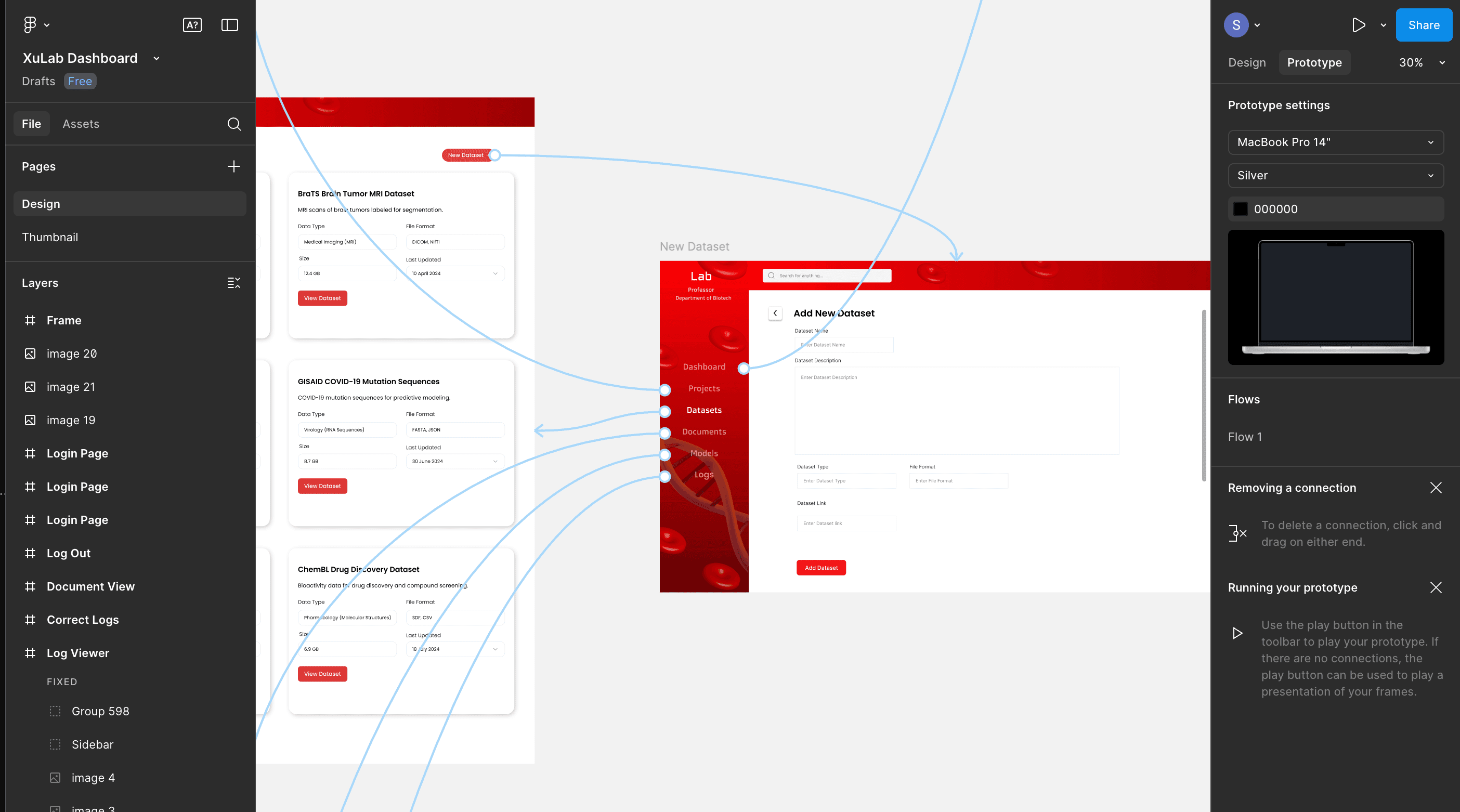
Prototyping the interface
Guess the prototype device I used? That's right! The all time favorite large screen monitors. Given the heavy usage of monitors by the researchers, I stuck to large screens.

Figma as always
Although there were bunch of templates to get started, I wanted to keep the design straight to point, which motivated me to work from scratch rather than "transfer learning".

Dataset Management
One main issue was the numerous datasets being used in the lab, which was a pain to manage. Imagine a page like an encyclopedia for the datasets! That was the idea.

Documentation Hub
The documents and its contents were at times a mystery and you can't view the contents unless you run a script. What if there was a way for the researchers to sumamrize the contents of a document for quicker review.